
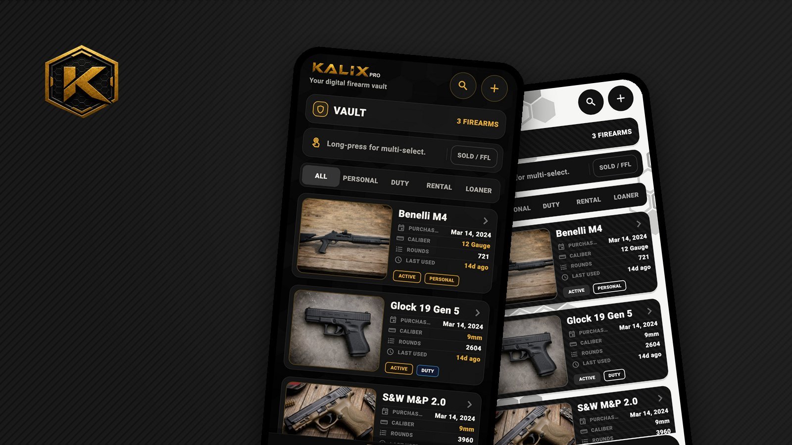
This one is for the people who like to know how the sausage gets made. Carbon ships in Kalix 1.8 (More, then Preferences, then Carbon). On the surface it's a new coat of paint. Behind it was a month of rewiring, redesigning and bug hunting. Here's the story.
The paint was baked in
Kalix was born dark, and its colors were written straight into every screen, a little like painting a car before deciding what color it should be. That's fine until you want a second color. You can't repaint something that was never meant to be repainted.
So step one wasn't design at all. It was pulling every color out of the screens and putting them in one place, a single "paint chart" that the whole app reads from. Kalix Dark is one chart. Carbon is another. Flip the switch and every screen picks up the new chart at once, without any of them needing to know which theme they're in.
It's the least glamorous part of the project, and the part that made everything else possible.
Carbon isn't "light mode"
The obvious light theme turns everything white with black text. We built it, looked at it, and it felt flat, like a spreadsheet. Not Kalix.
Carbon does something different: the cards stay dark, with a carbon-fiber weave and crisp white type, while the page behind them turns chalk-white. Think black rifle on a white bench mat.
That mix broke a rule the app had always quietly assumed: text is light. Inside a card it still is. But titles, labels and back arrows sitting directly on the white page suddenly had to be dark. Finding every one of those spots, and teaching the app the difference between "on a card" and "on the page", took longer than the theme itself.
The mockup graveyard
Before Carbon won, a lot of ideas lost. Arctic digital camo. Coyote tan with a faint hex grid. Gunmetal and copper. Onyx and ivory. Piano black. Smoked glass. Each one got built, lived with for a day or two on a real phone, and mostly thrown away.
Carbon & Chalk won because it kept the weight and attitude of the original Kalix while staying easy to read in full sun at an outdoor range. That last test, squinting at a phone at the bench, ended more contenders than anything else.
The bug that made one screen stutter
The first carbon-fiber cards looked perfect in screenshots. On a real phone, the More tab hitched every time you scrolled.
The culprit was how the weave was drawn. It came from a tiny repeating pattern, and the phone was stamping it onto each card piece by piece, over and over, like tiling a floor one small square at a time for every single frame.
The fix was to hand the phone the whole pattern as a single roll it could lay down in one pass. Same look, a fraction of the work, and the stutter vanished.
Lesson re-learned: the thing that looks cheapest on screen can be the most expensive one to draw.
Two small bugs worth sharing
- White on white. In Carbon, the "Enable PIN" button turned white, and so did its text. Instead of patching that one button, confirmation buttons now check how bright they are and pick black or white text to match, so it can't happen anywhere again.
- Ghost keys. The new Chalk Keys PIN pad first showed up as see-through grey ghosts. The keys were painting their white onto a layer that sat behind the hex background. Moving the paint onto the keys themselves brought them back to solid white.
What it means for you
Two finishes, Kalix Dark and Carbon, plus Match Phone, with every screen and pop-up tuned for both. And an app where the next theme, if there ever is one, is a new paint chart instead of another month of hunting colors.
Curious how something else in Kalix works? The Support page reaches the person who built it.
Posted in Build Log · Design · Themes · Behind the Scenes